1GETTING STARTED
1.1 Introduction
First of all, I would like to thank you for purchasing this theme. We’ve put in lots of love in developing this wordpress theme and are excited that you’ve chosen this theme for your website. We hope you find it easy to use our theme. This documentation guides you through the main features of the theme and guides you how to use and customize the theme.
1.2 System Requirements
At the basic level, this theme will require the following conditions:
- Apache 2.x or Microsoft IIS 7
- PHP 5.3.x
- MySQL 5.0.4 or higher
- WordPress 3.9+, 4.0+
Recommended PHP Configuration Limits: Many issues you may run into such as; white screen, demo content fails when importing, empty page content and other similar issues are all related to low PHP configuration limits. The solution is to increase the PHP limits. You can contact with your web host and ask them to increase those limits to a minimum or You can do this on your own by finding php.ini file in your root directory as follows:
- max_execution_time 360
- memory_limit 128M
- post_max_size 32M
- upload_max_filesize 32M
2INSTALLATION
2.1 Files Structure
At first, you need to download the package about my computer and then unzip the package. The Main Files Gives You All The Content Listed Below
- Data folder - Contains the “sample_data.xml” file, “widget.wie” and “theme_options.txt” file.
- Revslider folder - Contains the “slideonepage.zip” file.
- Theme installation package - Contains the sw_stabwall_theme_v1.0.0.zip (the newest version) file and sw_stabwall-child-theme.zip WordPress Theme. The child theme is only for users who make code changes.
2.2 Theme Installation
You can install the theme in two ways: through WordPress, or via FTP.
Note: If the theme file size is larger than 8M, please upload to FTP (File Transfer Protocol).
2.2.1 Theme Via FTP Installation
- Extract themename_version.zip.
- Load your FTP client, such as FileZilla.
- Upload the themename_version folder to the /wp-content/themes directory.
- In the left menu sidebar, go to Appearance >> Themes.
- Click Activate underneath the theme’s named section.
2.2.2 Theme Via WordPress Admin Panel Installation
Step 1 - Open the wp-admin panel (navigate through web browser to the folder where you have installed the WordPress e.g (www.your_domain.com/wp-admin/).
Step 2 - Login to your WordPress Dashboard and navigate to Appearance >> Themes. At the top of the page click the Add New button.
Step 3 - Click the Upload Theme button >> Choose File in Import from your computer section. Navigate to previously zipped theme package and open theme installator folder: Select your “ sw_stabwall_theme_v1.0.0.zip” file and click Install Now.
Step 4 - The uploading process will be started. You will see the message that Theme installed successfully.
Step 5 - After the installation you will be able to activate the theme to do this click the “blue” activation link.
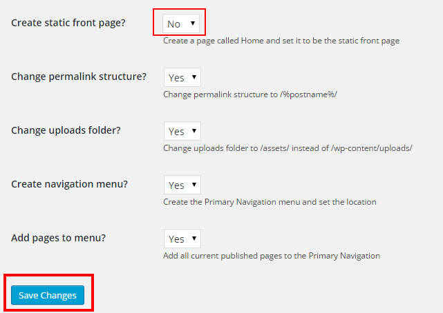
Step 6 - Select “Create static front page = No” and press “Save Changes” to complete the theme activation.
Once theme is installed, you need to install Required Plugins to get full features working.
2.3 Required Plugins Installation
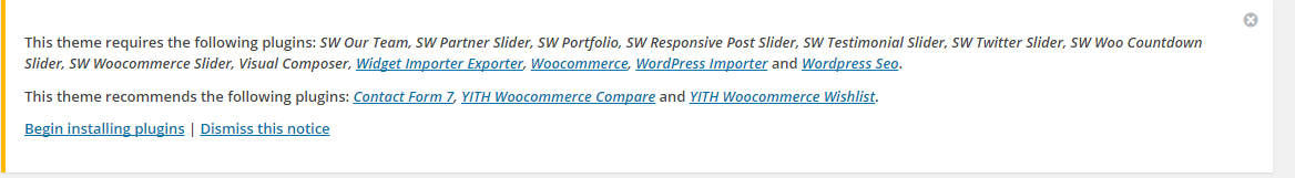
After installing and activating the theme you will see a yellow popup at the top of the page. Saying: “This theme requires the following plugins…” please click the ‘Begin Installing plugins’ link.
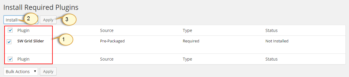
You will be redirected to ‘Install Required Plugins’ page, here you will find all of the theme required plugins. To install them just check all of them and from the drop down select install once installed do the same to activate them.
Note: If the plugins installation process could have a notice some plugins unsuccessful installation, please go to these plugins to install one by one. This case usually occurs as you select all plugins installation at once.
2.4 Sample Data Installation
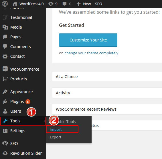
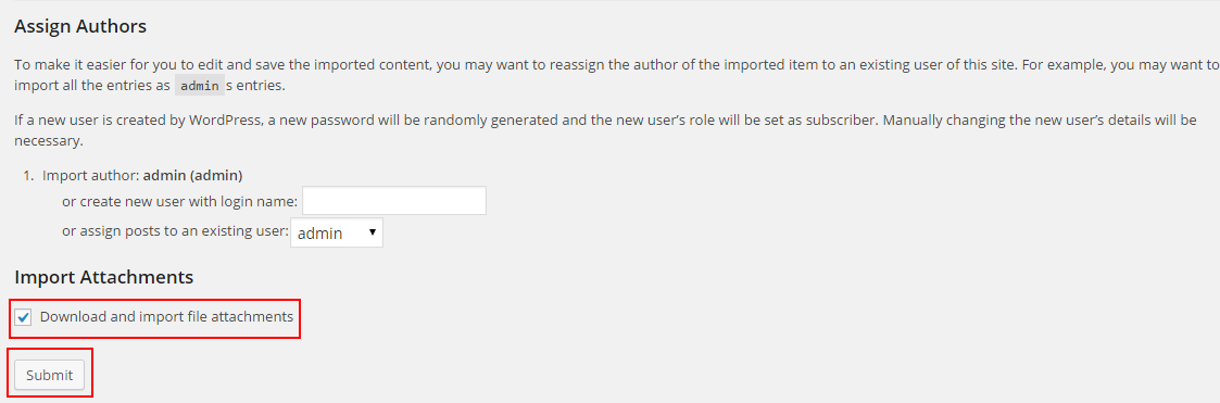
Step 1 - In the Administrator page, please navigate to Tools >> Import.
Step 2 - Please choose “WordPress” to import.

Step 3 - In Import WordPress page, click “choose file” button to select file “sample_data.xml” to upload.
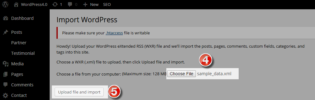
Step 4 - Assign Authors and Import Attachments with selecting “Download and import file attachments“ and then press “Submit” button.
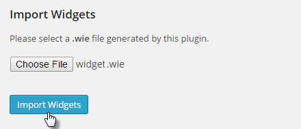
2.5 Widget Installation
Step 1 - In the Administrator page, please navigate to Tools >> Widget Importer & Exporter.
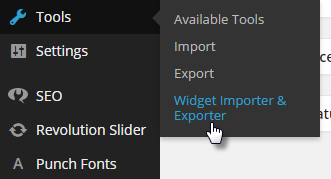
Step 2 - After that choose “widget_data.wie” file >> press Import Widgets button.
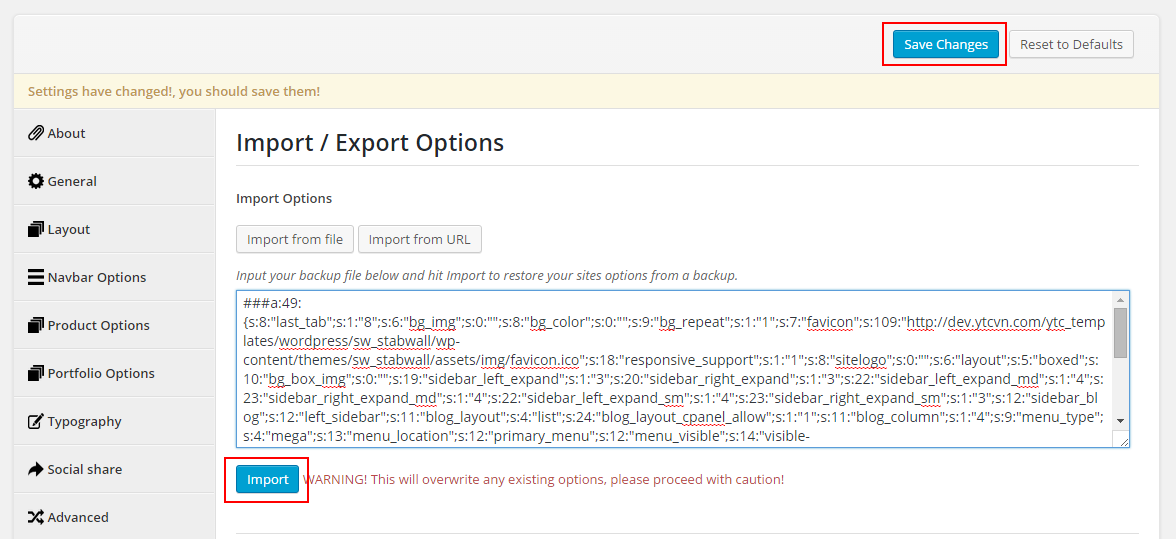
2.6 Import Theme Options
Step 1 - In the Administrator page, please navigate to Appearance >> Theme Options >> Import/ Export tab.
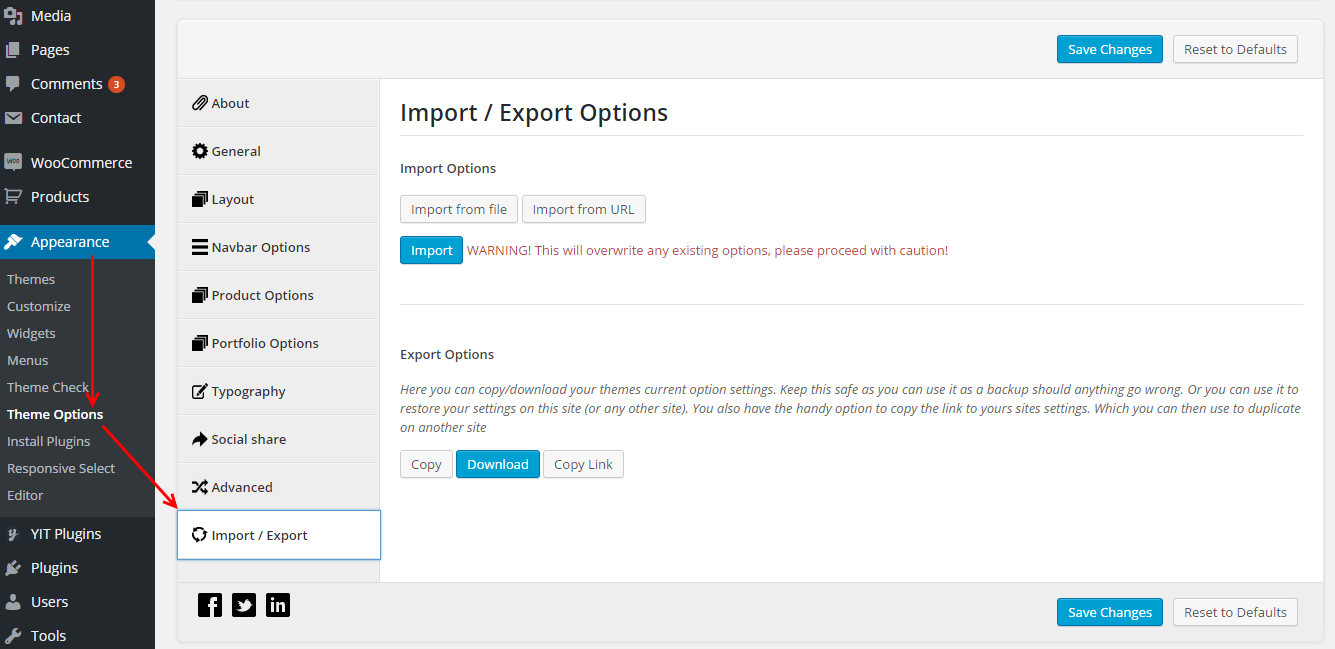
Step 2 - Click “Import the file” button >> open the “theme_options.txt” file with your NotePad editor >> Copy the content into textbox.
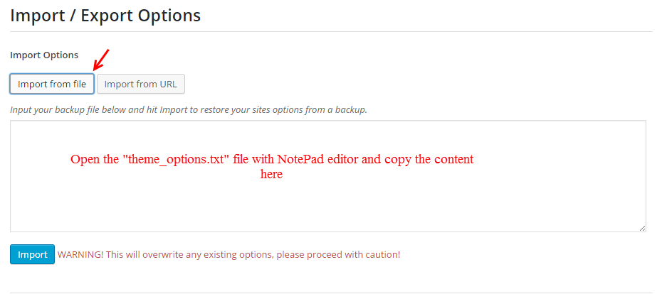
Step 3 - Finally, press “Import” and “Save Change” .
2.7 Import Revolution Slider
Step 1 - In the Administrator page, please navigate to Revolution Slider >> Click “Import Slider” button .
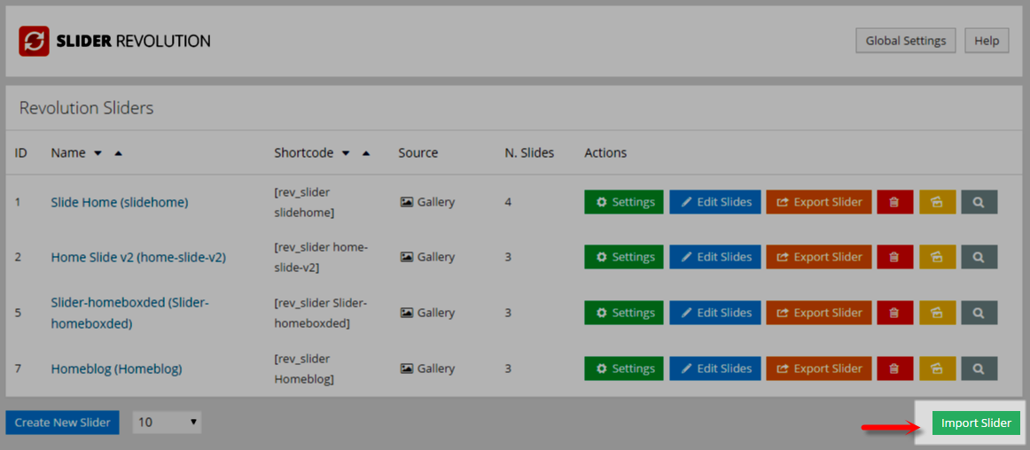
Step 2 - The “Import Slider” pop-up window, please choose the “slideonepage.zip” file (in the folder “revslider”) and press “Import Slider“ button.
2.8 Change Product Image Sizes
You can change the image size in “Woocommerce > Settings > Products > Display” section.
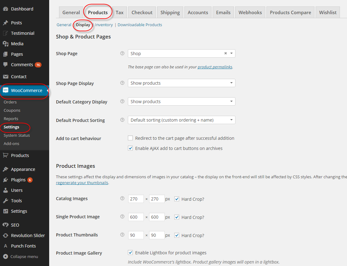
After change the images sizes, you should regenerate all the thumbnails. For this, you should install and activate “Regenerate Thumbnails” plugin.
2.9 MailChimp for WordPress
SW StabWall Theme has used the MailChimp Plugin. It is the subscribe form. You can go Here to read more about this plugin.
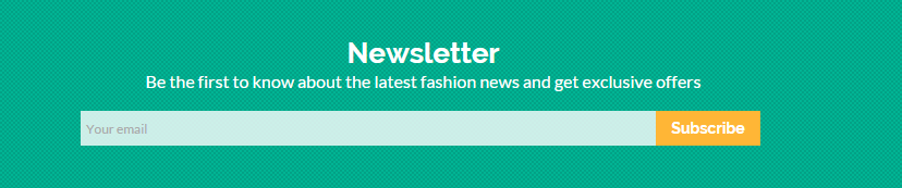
The Frontend Appearance
The Backend Settings
1. In your Administrator page, please navigation to MailChimp for WP >> Forms
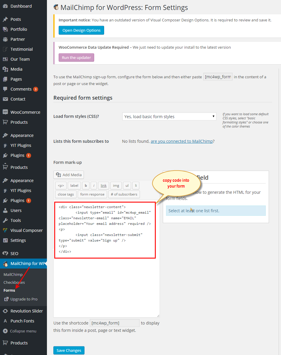
2. And copy the code row the following into your form mark-up:
|
1
2
3
4
5
|
<div class="newsletter-content">
<input type="email" id="mc4wp_email" class="newsletter-email" name="EMAIL" placeholder="Your email" required />
<input class="newsletter-submit" type="submit" value="Subscribe" />
</div>
|
3THEME OPTIONS
In your Admin Panel, navigate to Appearance >> Theme Options to configure.
3.1 General
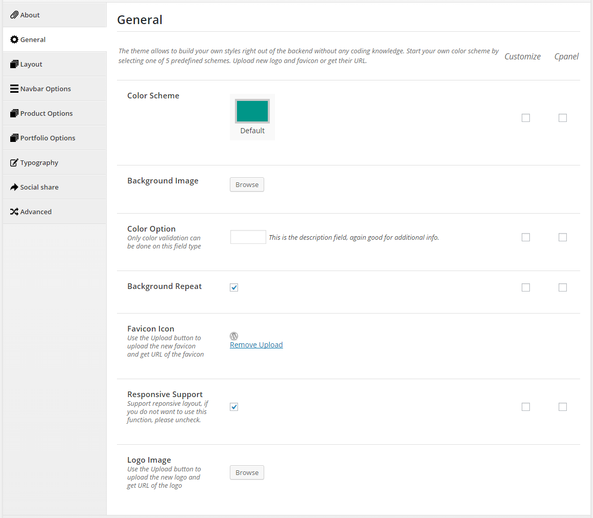
- Color Scheme - Color of schemes: Default.
- Background Image - Browse to select image file that you want for background image.
- Color Option - Only color validation can be done on this field type. This is the description field, again good for additional info.
- Background Repeat - This option determines if the background image is repeated (Used for boxed layout).
- Favicon Icon - Use the Upload button to upload the new favicon and get URL of the favicon.
- Responsive Support - Support reponsive layout, if you do not want to use this function, please uncheck.
- Logo Image - Use the Upload button to upload the new logo and get URL of the logo.
3.2 Layout
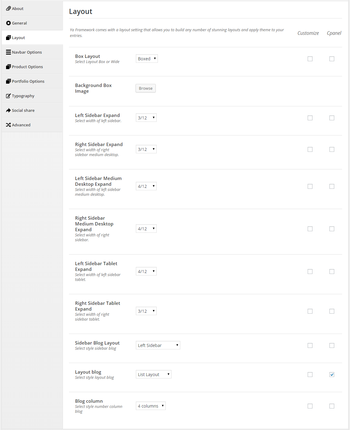
- Box Layout - Select Layout Box or Wide.
- Background Box Image - Browse to select image that you want.
- Left Sidebar Expand - Select width of left sidebar.
-
Right Sidebar Expand - Select width of right sidebar medium desktop.
- Left Sidebar Medium Desktop Expand - Select width of left sidebar medium desktop.
- Right Sidebar Medium Desktop Expand - Select width of right sidebar.
- Left Sidebar Tablet Expand - Select width of left sidebar tablet.
- Right Sidebar Tablet Expand - Select width of right sidebar tablet.
- Sidebar Blog Layout - Select style sidebar blog: Full Layout/Left Sidebar/Right Sidebar/Left Right Sidebar.
- Layout product - Select style layout blog: List Layout/Right Sidebar/Grid Layout.
- Blog column - Select style number column blog: 2 columns/ 3 columns/ 4 columns.
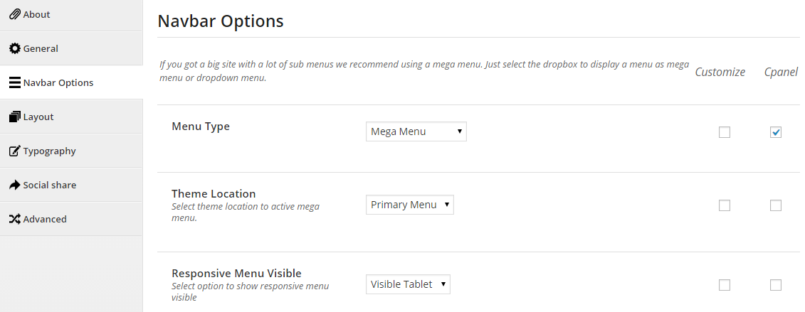
- Menu Type - Select “Mega Menu” or “Dropdown Menu” type.
- Theme Location - Select theme location to active mega menu.
- Responsive Menu Visible - Select option to show responsive menu visible.
3.4 Product Options
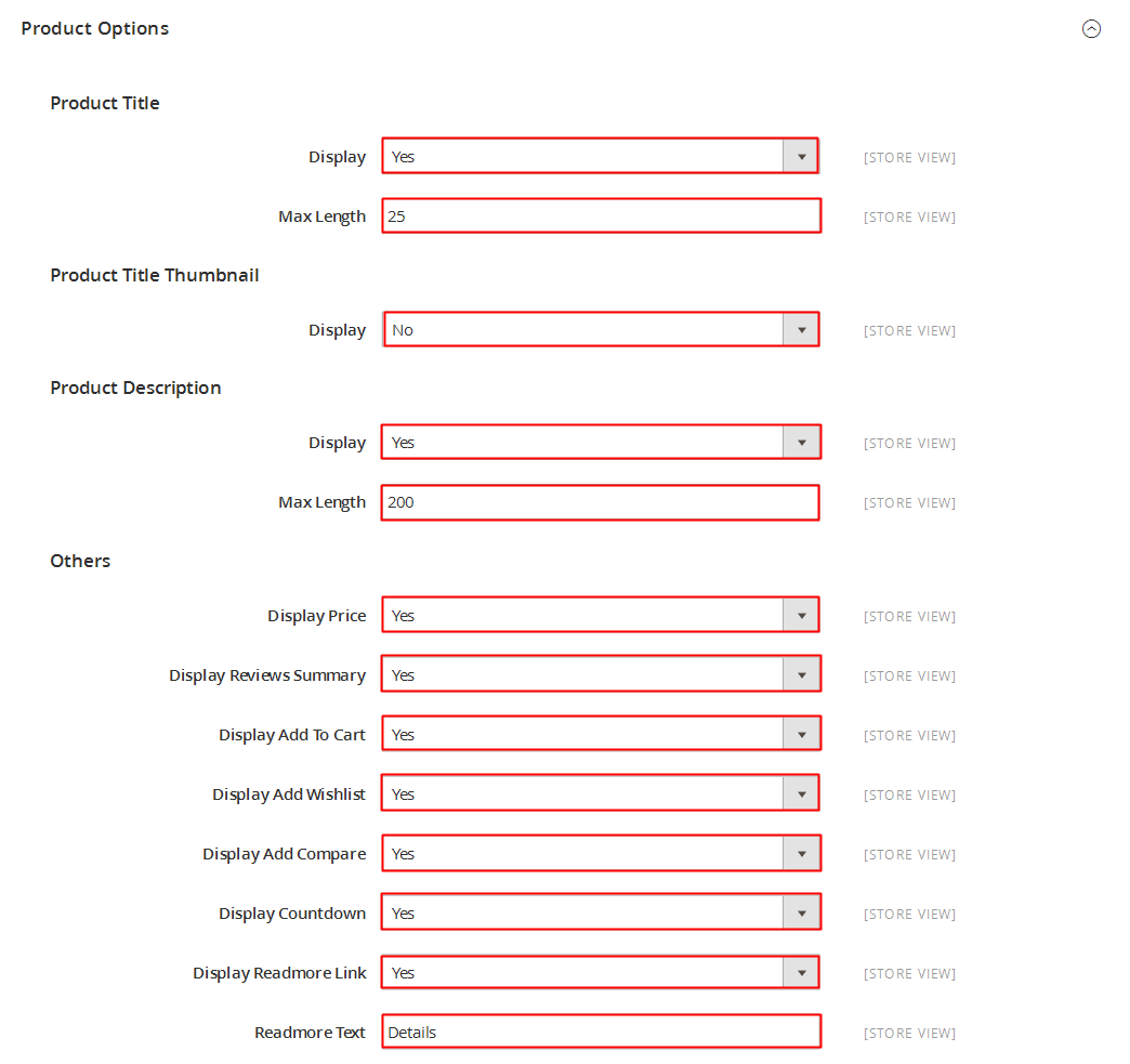
- Product Listing column Desktop - Select number of column on Desktop Screen.
- Product Listing column Medium Desktop - Select number of column on Medium Desktop Screen.
- Product Listing column Tablet - Select number of column on Tablet Screen.
- Sidebar Product Layout - Select style sidebar product.
3.5 Portfolio Options
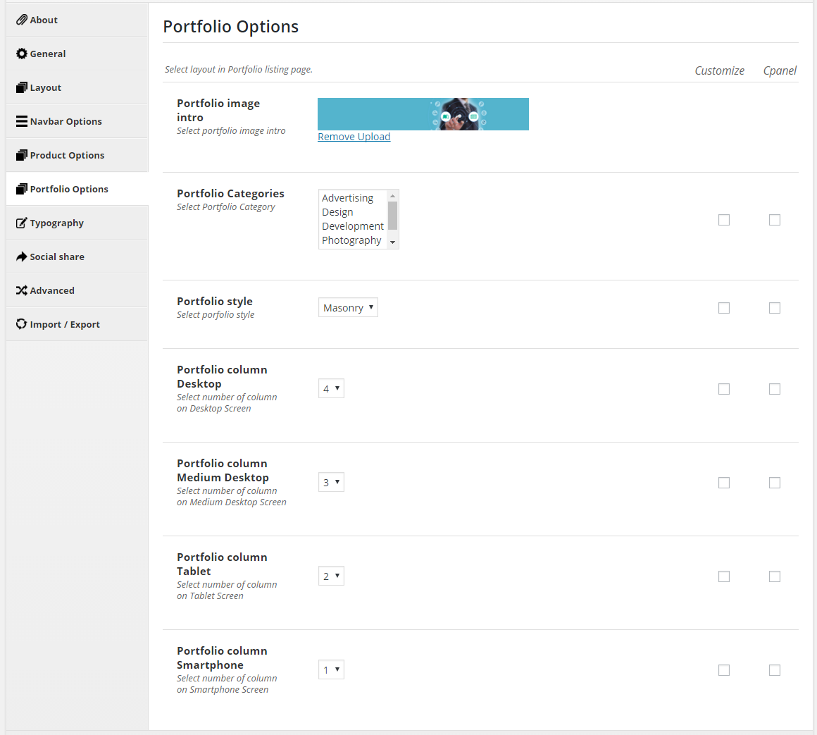
- Portfolio image intro - Select portfolio image intro.
- Portfolio Categories - Select Portfolio Category.
- Portfolio style - Select portfolio style.
- Portfolio column Desktop - Select number of column on Desktop Screen.
- Portfolio column Medium Desktop - Select number of column on Medium Desktop Screen.
- Portfolio column Tablet - Select number of column on Tablet Screen.
- Portfolio column Smartphone - Select number of column on Smartphone Screen.
3.6 Typography
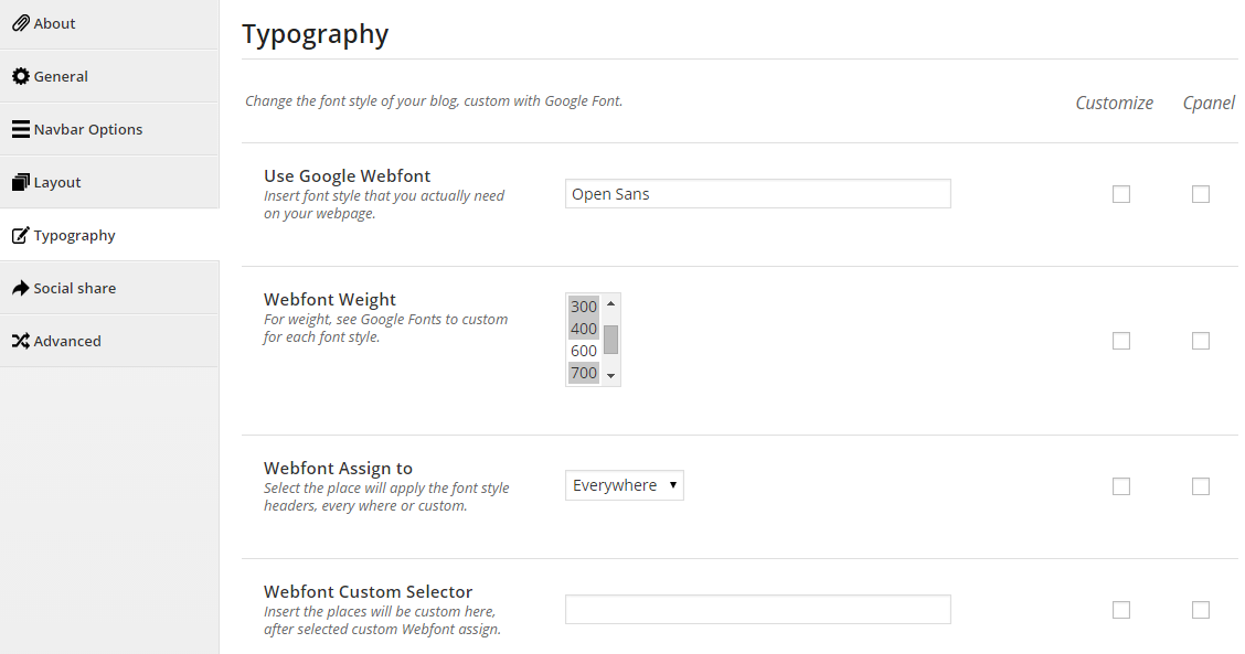
- Use Google Webfont - Insert font style that you actually need on your webpage.
- Webfont Weight - For weight, see Google Fonts to custom for each font style.
- Webfont Assign to - Select the place will apply the font style headers, every where or custom.
- Webfont Custom Selector - Insert the places will be custom here, after selected custom Webfont assign.
Turn on/turn off sharing buttons appearing in Home page
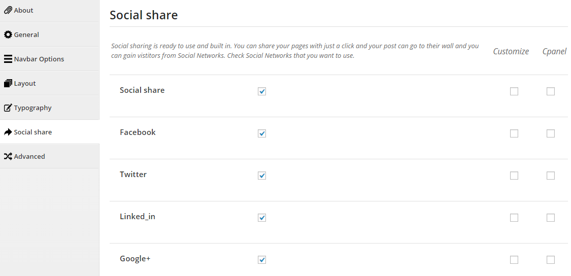
- Social share - Enable Social share button.
- Facebook - Enable Facebook Share button.
- Twitter - Enable Twitter Share button.
- Linked_in - Enable LinkedIn Share button.
- Google+ - Enable Google+ Share button.
3.8 Advanced
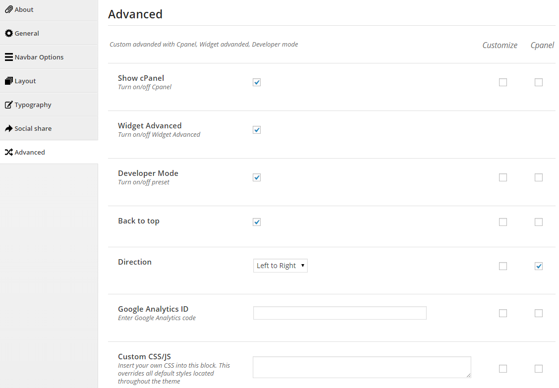
- Show cPanel - Turn on/off Cpanel.
- Widget Advanced - Turn on/off Widget Advanced.
- Developer Mode - Turn on/off preset.
- Direction - Left To Right / Right To Left.
- Active Effect Scroll - Check to active effect scroll in homepage.
- Google Analytics ID - Enter Google Analytics code.
- Custom CSS/JS - Insert your own CSS into this block. This overrides all default styles located throughout the theme.
4MENU MANAGEMENT
There are three menu locations in the theme:
- Primary Menu
- Header Menu
- Footer Menu
Mega Menu has 3 sub-level menu styles including List Style, Column Style and Preview Mode. Please check next sections to see how to configure the Mega Menu.
If you have imported demo content, go to Existing Menu or else go to Creating a New Menu to create a new menu.
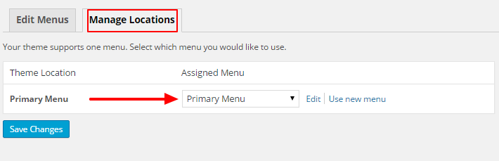
Step 1: Go to Appearance > Menus
Step 2: In the Manage Locations area, assign menu to appropriate Theme Locations. Click Save Changes
Step 1: Go to to Appearance > Menus
Step 2: Click Create a new menu. Enter a menu’s name and click Create Menu
Step 3: Check the menu item in the boxes in the left column, click Add to Menu to add items to the menu and drag/drop to arrange them.
Step 4: Click Save Menu
Step 5: Now assign your newly created menu to appropriate locations
5MEGA MENU
In your Administrator Page, please navigate to Appearance > Menus to configure the menu structure. Mega Menu can contains three sub-menu styles: List Style, Column Style and Preview Mode.
5.1 List Style
List Style is the traditional dropdown-menu style.
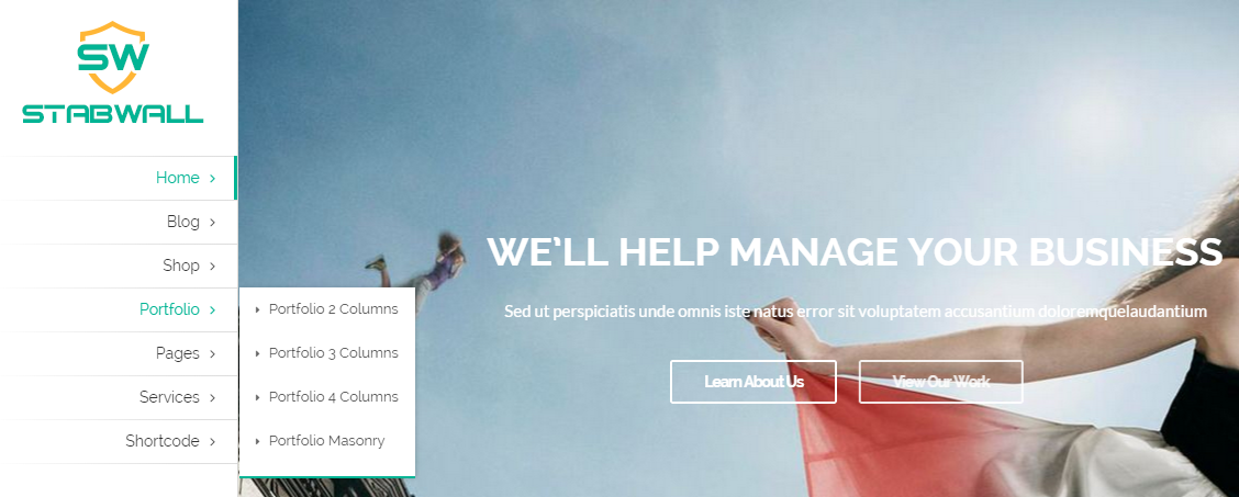
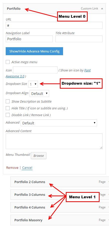
1. We call Parent Level Menu Level 0. Then, next levels are Level 1, Level 2…
2. Click on a Menu Level 0 (Parent Level Menu ) item and select Dropdown Size = “1″ in selectbox
3. Click “Save”
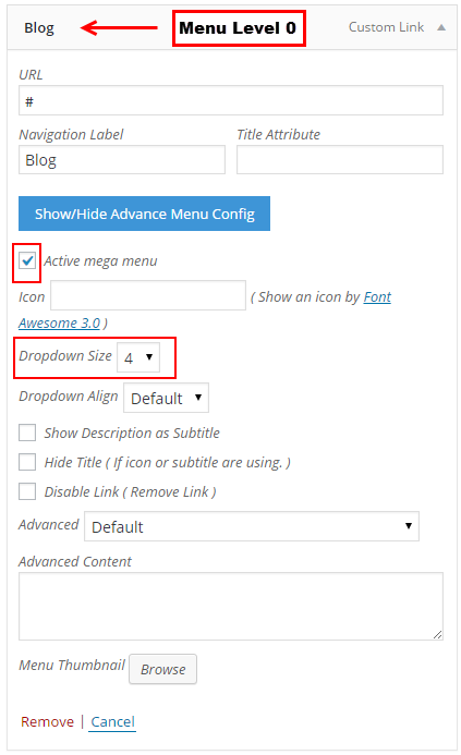
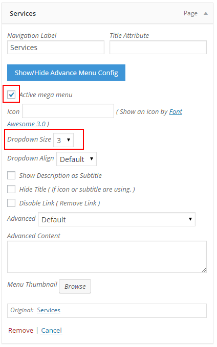
The parameter explanation in Advanced Menu Config:
- Active mega menu: Allow to activate/inactivate Mega Menu
- Icon: Using icon-* class to display Icon for any menu item with Font Awesome intergrated. Refercence Font Awesome for details
- Dropdown Size: Set the width of dropdown menu. (ex: min = 1 (= 150px); max = 6 (= 900px)).
- Dropdown Align
- Only for menu items level 0 - If you want dropdown (if have) align by right direction, config it to ‘Right’ instead of ‘Left’ or ‘Default’ - ‘Default’: no class be add to dropdown, everything are nature by default css. - ‘Left’ / ‘Right’: add to dropdown an utility class for float it left/ right. Make it align as you want.
- Show Description as Subtitle
- Mean as the name. - Description is core attribute of menu item. You may need check to show it in the metabox screen.
- Hide Title
- Sometime you need hide the title of menu, select ‘Yes’ value please. In this case, Icon or Subtitle or Advanced Content are need to show as replacer.
- Disable Link: Allow to disable link.
- Advanced:
- Some advanced functions are placed here. - ‘Default’: NOOP, do nothing. Sure, it is not advanced - ‘Use as Divider’: Show any icon, title, subtitle, content. Divider style only. - ‘Append Advanced Content’: Append content after menu title block (icon+title+subtitle) - ‘Append Advanced Content with Shortcode’: as above, but ‘do_shortcode’ with this before append.
- Advanced content: Insert content follow Advanced ( input HTML, image… not included js & css)
- Menu Thumbnail: Allow to upload thumbnail for menu
5.2 Column Style
Column Style is a multi-column style menu to display menu items (such as posts, pages, categories) like below figure
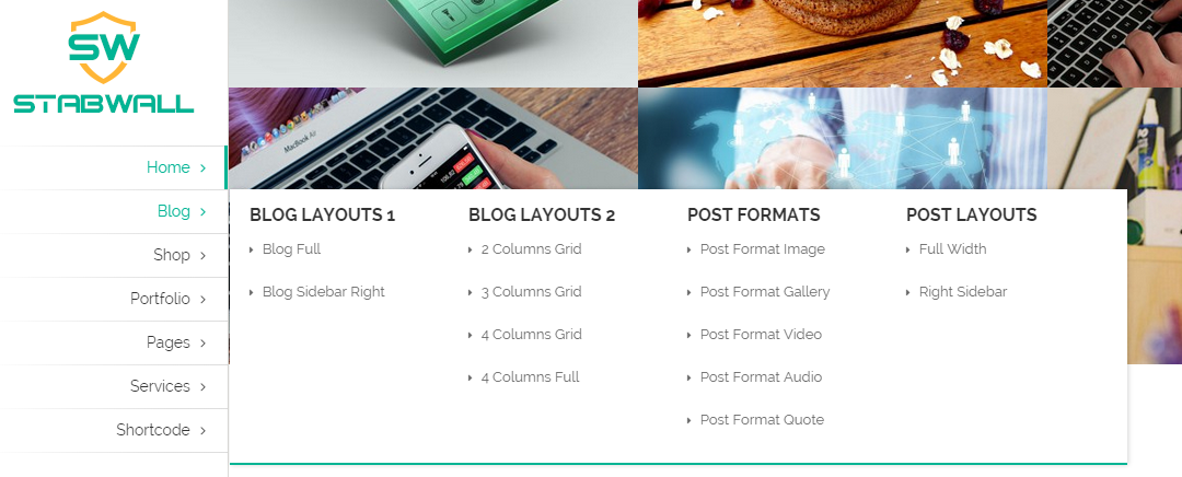
1. Column Style MUST HAVE Level 0, Level 1 (also called Heading of Column), and Level 2 menu items.
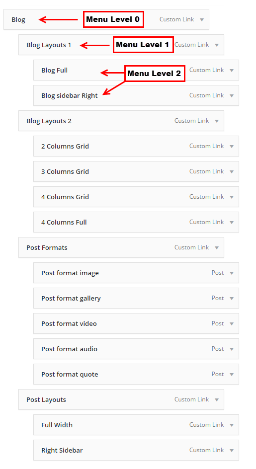
2. Click on a Level 0 menu item, check box “Active mega menu” and select (Dropdown Size = “4″) (Dropdown Size is only displayed for Menu Level 0)
3. Click “Save”
5.3 Preview Mode
The Preview mode looks like below figure. In this mode, visitors will see latest posts in a category or a tag
1. In this mode have Level 0, Level 1, and Level 2 menu items.
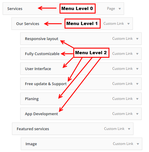
2. Click on a Level 0 menu item, check box “Active mega menu” and select (Dropdown Size = “3″) (Dropdown Size is only displayed for Menu Level 0)
3. Click “Save”
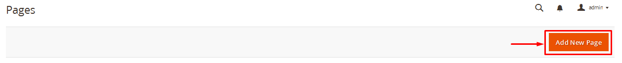
6PAGES
6.1 How To Create A New Page
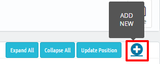
Here is a screenshot that shows you the various areas and descriptions of the page settings described above.
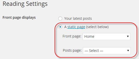
6.2 Setting Up Home Page
Setting up your home page is the same as setting up any other regular pages, except that you need to specify in the settings which page will be your Main Home Page.
How To Set Your Home Page
6.3 Page Templates
SW StabWall includes several page templates to choose from, and you will need to choose the page template that suits your needs. For example, if you want a page that is Contact Us Page of the browser window, then you would select the Contact page template. All of this is done in the Pages section of your WordPress admin.
Below are the Page Templates, along with a description of each one.
- Default Template - This is the Default page template that automatically has the sidebar with it. Choose this template for your blog.
- About Us Page - This is the About Us page template. Choose this template when you want to give the customers the information about yourself website.
- Contact Us Page - This is the Contact page template that you should choose when you make your contact page with Google Map & a contact form.
- FAQ Page - This is the FAQ page template. Choose this template when you make your FAQ page.
- Portfolio Pages - These are all the Portfolio page layout templates. Choose 2, 3, 4 columns or portfolio masonry depending on the layout you want.
7
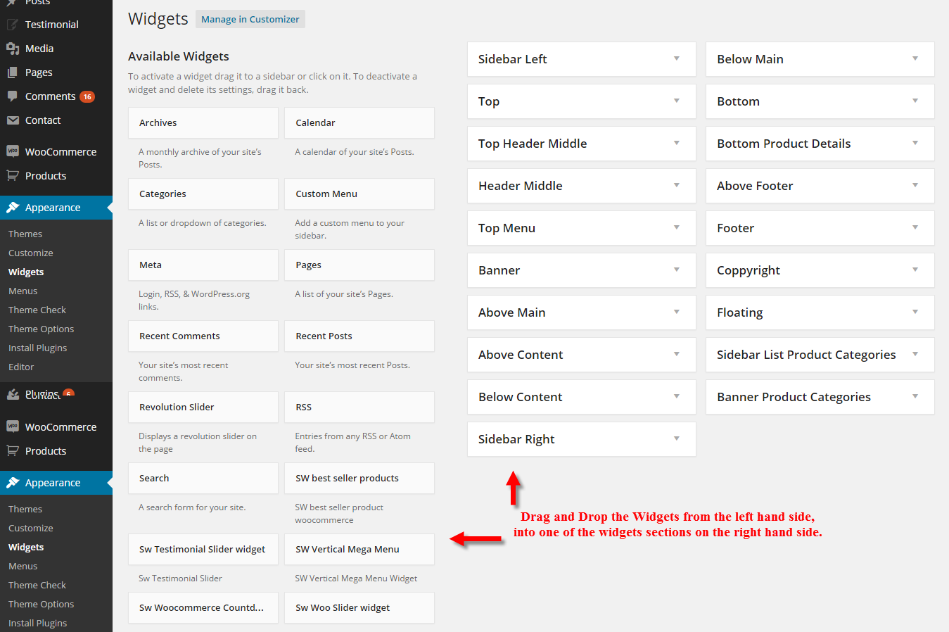
WIDGETS
7.1 To Add Widgets, Follow The Steps Below.
Step 1 - Navigate to Appearance > Widgets to access the list of widgets and widget sections that they can be added to. The left hand side shows all the widgets you can use. The right hand side shows all the different sections you can add widgets to.
Step 2 - Simply drag and drop the widget you want into the widget section you want on the right hand side.
Step 3 - When finished, make sure to click Save in the widget editing box to save the widgets added to your sidebar.
Here Is A Screenshot That Shows The Various Areas Of The Widget Section Described Above.
7.2 Widgets Using Theme
SW StabWall has used the widgets as following:
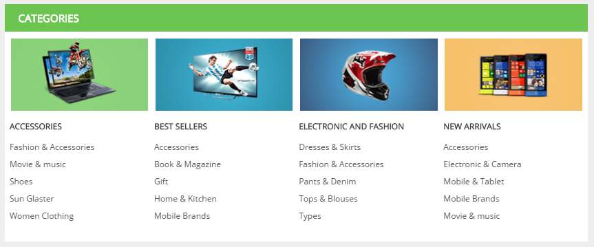
1. SW Categories Widgets
- Title - Title of widget
- Template - Select template that you want
- Category Name - Select category name
-
Order by - Allow to order by following field:
- ID
- Name
- Author
- Date
- Title
- Modified
- Parent
- Rand
- Comment Count
- Order - Allow to order Ascending/Descending
- Number of Categories - Number of category will be shown
-
Advanced Options - Support 3 options for your advance
- Widget Style - Style of widget ( container is selection )
-
Widget Display - Option select widget display. There are 3 option:
- All - Widget will display all in theme in the sidebar that’s selected.
- Except on selected - Allow to choose pages that don’t want to show widget
- Only on selected - Allow to choose pages that want to show widget
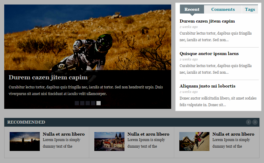
2. SW Tabber Widgets
- Title - Title of widget
- Template - Select template that you want
- Number of popular posts to show - Allow to display number of popular posts.
- Number of recent posts to show - Allow to display number of recent posts.
- Length excerpt posts to show - Allow to show the length excerpt posts.
- Order - Allow to order Ascending/Descending
- Number of comments - Number of comments will be shown
- Excerpt length comments (in words) - Allow to display the excerpt length comments.
-
Advanced Options - Support 3 options for your advance
- Widget Style - Style of widget ( container is selection )
-
Widget Display - Option select widget display. There are 3 option:
- All - Widget will display all in theme in the sidebar that’s selected.
- Except on selected - Allow to choose pages that don’t want to show widget
- Only on selected - Allow to choose pages that want to show widget
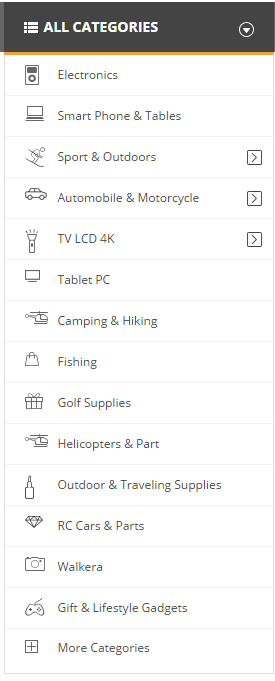
3. SW Vertical Mega Menu Widgets
- Title - Title of widget
- Template - Select template that you want
- Menu Name - Select menu name that you want
-
Advanced Options - Support 3 options for your advance
- Widget Style - Style of widget ( container is selection )
-
Widget Display - Option select widget display. There are 3 option:
- All - Widget will display all in theme in the sidebar that’s selected.
- Except on selected - Allow to choose pages that don’t want to show widget
- Only on selected - Allow to choose pages that want to show widget
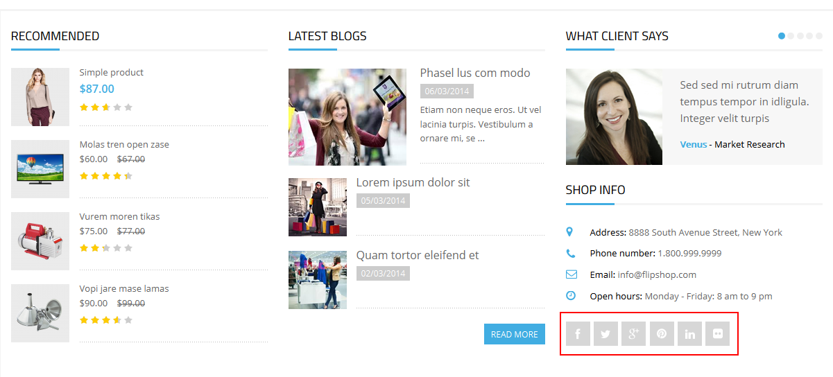
4. SW Social Widgets
- Title - Title of widget
- fa-* | title - Input class name of Font Awesome icon.
- Link - Input your social link.
-
Advanced Options - Support 3 options for your advance
- Widget Style - Style of widget ( container is selection )
-
Widget Display - Option select widget display. There are 3 option:
- All - Widget will display all in theme in the sidebar that’s selected.
- Except on selected - Allow to choose pages that don’t want to show widget
- Only on selected - Allow to choose pages that want to show widget
5. SW Top Widgets: Login
- Title - Title of widget
- Template - Select “Login” template.
-
Advanced Options - Support 3 options for your advance
- Widget Style - Style of widget ( container is selection )
-
Widget Display - Option select widget display. There are 3 option:
- All - Widget will display all in theme in the sidebar that’s selected.
- Except on selected - Allow to choose pages that don’t want to show widget
- Only on selected - Allow to choose pages that want to show widget

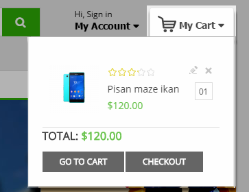
6. SW Top Widgets: Cart
- Title - Title of widget
- Template - Select “Cart” template.
-
Advanced Options - Support 3 options for your advance
- Widget Style - Style of widget ( container is selection )
-
Widget Display - Option select widget display. There are 3 option:
- All - Widget will display all in theme in the sidebar that’s selected.
- Except on selected - Allow to choose pages that don’t want to show widget
- Only on selected - Allow to choose pages that want to show widget
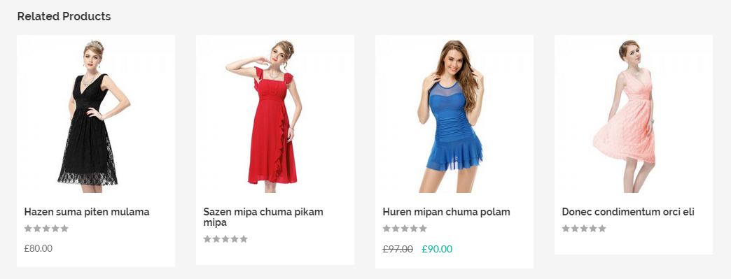
7. SW Related Products
- Title - Title of widget
- Template - Select “Slide” template.
- Number of Posts - Allow to display number of posts.
-
Advanced Options - Support 3 options for your advance
- Widget Style - Style of widget ( container is selection )
-
Widget Display - Option select widget display. There are 3 option:
- All - Widget will display all in theme in the sidebar that’s selected.
- Except on selected - Allow to choose pages that don’t want to show widget
- Only on selected - Allow to choose pages that want to show widget
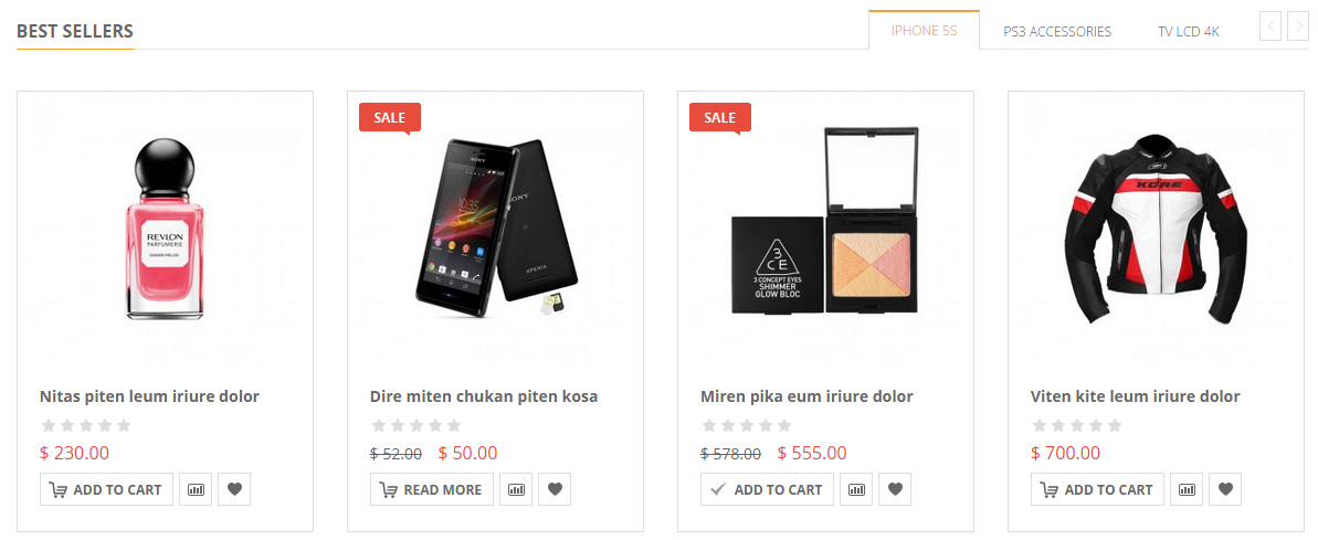
8. SW Best Seller Products
- Title - Title of widget
- Template - Select “Slide” template.
- Number of Posts - Allow to display number of posts.
- Style title - Select style “title1″.
-
Advanced Options - Support 3 options for your advance
- Widget Style - Style of widget ( container is selection )
-
Widget Display - Option select widget display. There are 3 option:
- All - Widget will display all in theme in the sidebar that’s selected.
- Except on selected - Allow to choose pages that don’t want to show widget
- Only on selected - Allow to choose pages that want to show widget
8
PORTFOLIO
8.1 Portfolio 2 Columns
Frontend Editor - Click on “pencil” sign to configure the portfolio settings
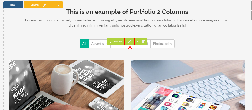
The pop-up window will display the portfolio settings so that you can configure the content as you want:
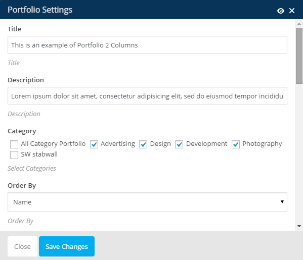
- Title - Input title of portfolio.
- Description - Input Description of portfolio.
- Category - Select Category
- Order By - Allow to order by Name/Author/Date/title/Modified/Parent/ID/Random/Comment Count.
- Order - Allow to order Descending/Ascending.
- Number Of Post - Allow to display number of post. For example: “4″ - will display 4 posts.
-
Number of Columns - Allow to display number of columns on the devices:
- Number of Columns >1200px
- Number of Columns on 992px to 1199px
- Number of Columns on 768px to 991px
- Number of Columns on 480px to 767px
- Number of Columns in 480px or less than
- Layout - Select Layout Fitrows / Masonry style.
- Show Tab - Allow to show tab Or not
- Show button loadmore - Allow to show loadmore button Or not.
Note: With the Portfolio 3 OR 4 Columns Settings part do the same. If you want to set to display 3 or 4 columns, only need to select number of columns on each devices as you want. With the Portfolio Masonry, you select “Masonry” layout.
9
SHORTCODE
9.1 Shortcode Blog
Frontend Editor - Click on “pencil” sign to configure the Shortcode Blog settings
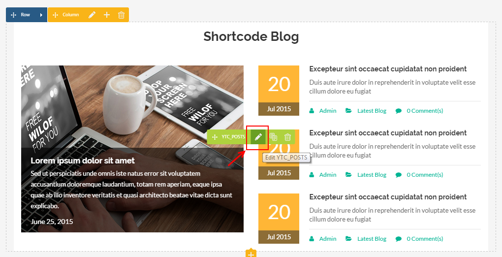
The pop-up window will display the Shortcode blog settings so that you can configure the content as you want:
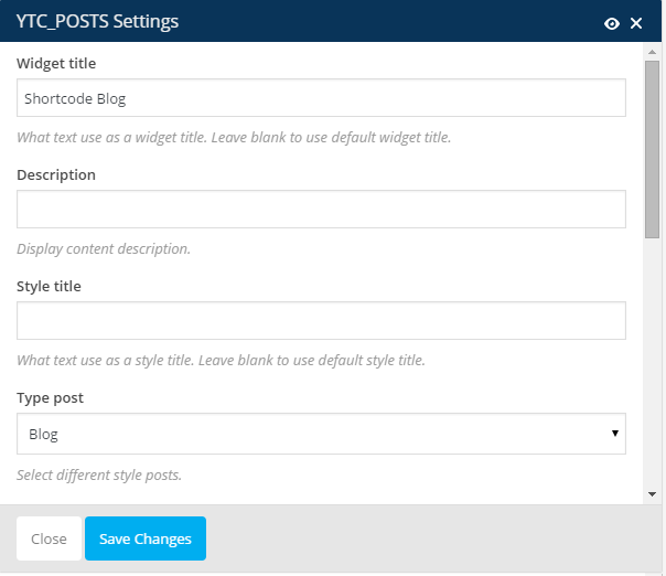
- Widget title - Input title of widget.
- Description - Input Description of content.
- Style title - Input style of tile as you want. Leave blank to use default style title.
- Type post - Allow to select the different type post.
- Category filter: - Allow to select category.
- Number of posts to show - Allow to display number of post. For example: “4″ - will display 4 posts.
- Excerpt length (in words) - Limit post excerpt length or post content length using number of words.
- Extra class name - If you wish to style particular content element differently, then use this field to add a class name and then refer to it in your css file.
- Order way - Designates the ascending or descending order of the ‘orderby’ parameter. Read more at here .
- Order by - Select how to sort retrieved posts. Read more at here .
9.2 Shortcode Our Team
Frontend Editor - Click on “pencil” sign to configure the Our Team settings
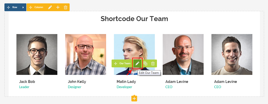
The pop-up window will display the Our Team settings so that you can configure the content as you want:
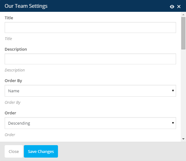
- Title - Input title of widget.
- Description - Input Description of content.
- Order by - Allow to order by Name/Author/Date/Title/Modified/ID/Random/Parent/Comment Count.
- Order - Allow to order Descending/Ascending
- Number of posts to show - Allow to display number of post. For example: “6″ - will display 6 posts.
-
Number of Columns - Display number of columns on devices:
- Number of Columns >1200px
- Number of Columns on 992px to 1199px
- Number of Columns on 768px to 991px
- Number of Columns on 480px to 767px
- Number of Columns in 480px or less than
- Speed - Set speed of slide (Faster = Slower)
- Auto Play - Set the “autoplay” parameter to “true”, so the slider will start playing as soon as the page loads and vice versa.
- Layout - Select Default Layout.
- Interval - Set timer interval between slide.
- Total Items Slided - Allow to set total item slided. For example: Set “1″ - Slider will run one by one.
9.3 Shortcode Testimonial Slider
Frontend Editor - Click on “pencil” sign to configure the Shortcode Testimonial Slider settings
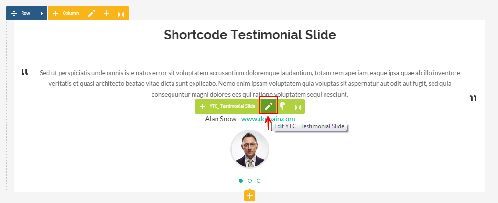
The paramenter in Shortcode Testimonial Slider settings has the meaning as above parts.
10
OTHER
- SUPPORT - If you have any questions that are beyond the scope of this help file, please send us via: Support Tickets System
- FAQs - Go to Here to view more the Frequently Asked Questions.
3.7 Social Share