1 Installation – Back to top
- Firstly, you must install Prestashop version 1.6.x. Please Click Here to read more about How To Install Prestashop version 1.6.x
- Secondly, prepare for installing the SP Hot Collections. The installation contains 5 steps as following:
Step 1: Login to your Prestashop admin panel and Go to Back Office >> Modules >> Modules. At the top of the page, click the Add a new module button.

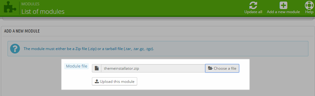
Step 2: Click “Choose a file” button to select your module .zip file “mod_sp_hot_collections_pres1.6-res_v1.0.1.zip” that you have downloaded and then click “Upload this module” button.
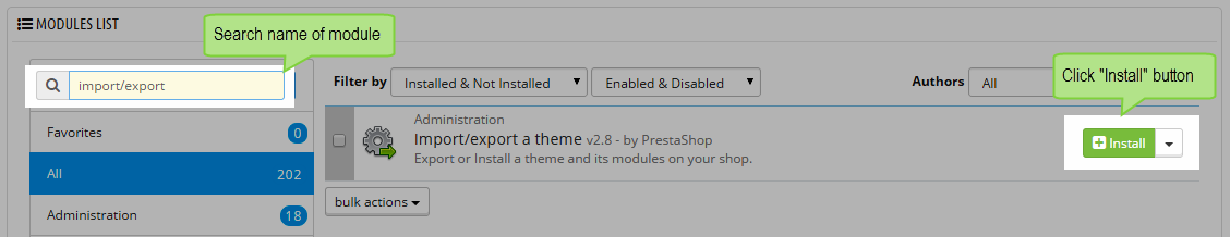
Step 3: The new module will be located in the module list. Search the name of module and Click on the Install button to install the module.
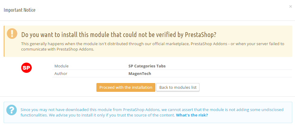
Step 4:You will see a notification messages, please click “Proceed with the installation” button to finish the installation process.
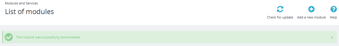
Step 5: The uploading process will be started. You will see the message “the module was successfully downloaded”.
2 Configuration – Back to top
Below is a complete interface of SP Hot Collections module
Please find to the module that you have completely installed to configure this module.
The parameters are divided into the following groups:
- GENERAL OPTIONS
- SOURCE OPTIONS
- CATEGORIES OPTIONS
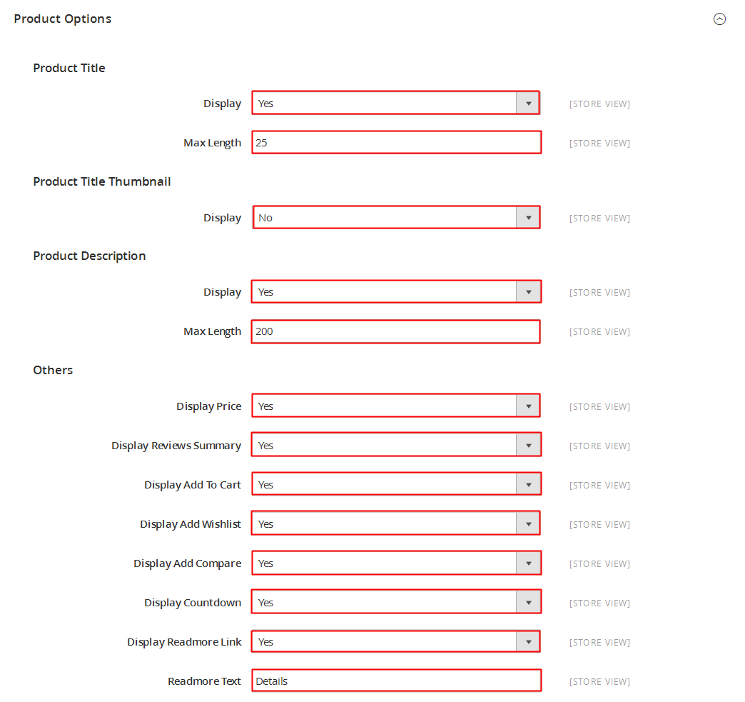
- PRODUCT OPTIONS
Let’s look at the parameters in detail:
GENERAL OPTIONS
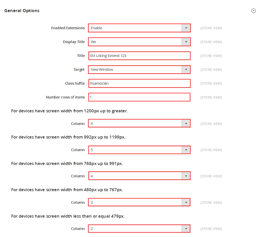
- Title – Input title for the module.
- Module Class Suffix – A suffix is applied to the CSS class of module. This allows for individual module styling.
- Display Title Module – Enable/Disable title of module.
- Status – Set status enable/disable for the module.
- Hook into – Select Hook into in list box. Please click Here to read more How To Create Custom CMS Hook Page.
-
FOR CATEGORIES: # Column – Set # column for each device
- For devices have screen width from 1200px to greater.
- For devices have screen width from 768px up to 1199px.
- For devices have screen width from 480px up to 767px.
- For devices have screen width less than or equal 479px.
-
FOR PRODUCTS: # Column – Set # column for each device
- For devices have screen width from 1200px to greater.
- For devices have screen width from 768px up to 1199px.
- For devices have screen width from 480px up to 767px.
- For devices have screen width less than or equal 479px.
-
Open Link – Target to open links:
- New window – Open the link in the new window/tab.
- Same window – Open the link in the same window/tab.
- Popup window – Open the link in new pop-up window.
SOURCE OPTIONS
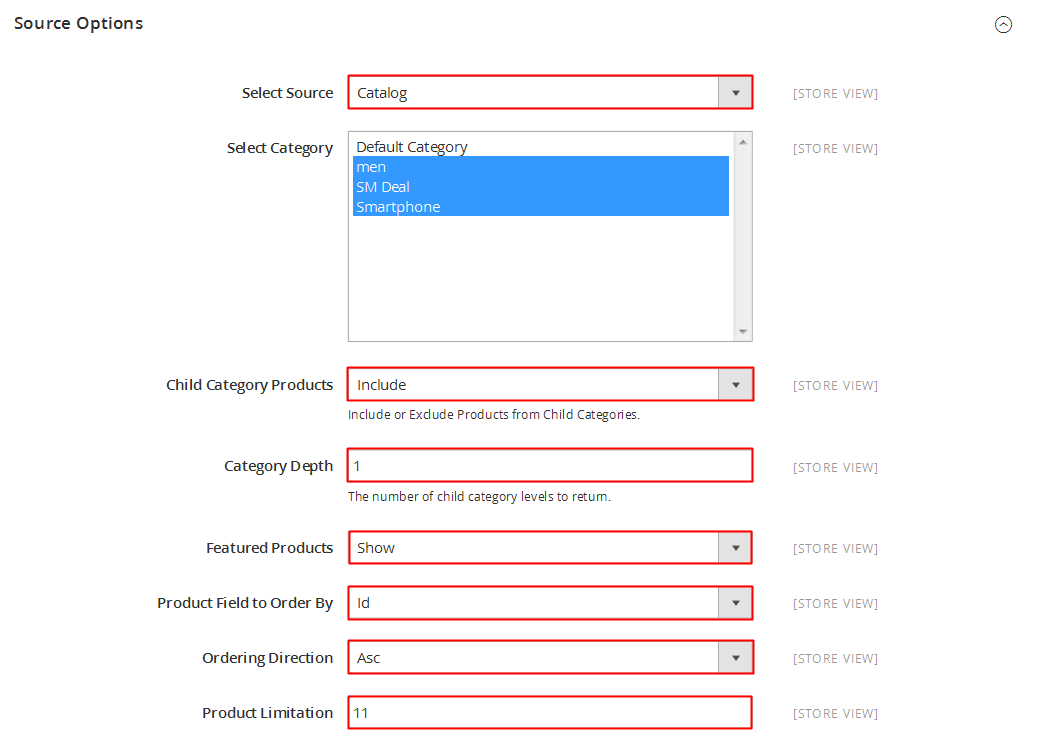
- Select Categories – Select categories.
- Product Field to Order By - Allow to set Product Field to Order By: “Name/ID/Date Add/Price/Sell”.
- Ordering Direction - Allow to order ascending/descending direction for field.
- Count - Allow to set the number of product to be displayed in slider.
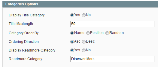
CATEGORIES OPTIONS
- Size image(WxH) – Select size of category image in list box.
- Display Title – Allow to display title of categories or not.
- Category Name Maxlength – The limited number of characters of category Name.
- Display Description – Allow to display description of category or not.
- Description Category Maxlength – The limited number of characters of category description.
- Display Readmore Category - Allow to display readmore category button.
- Categories Order By – Set Categories to Order By: “Name/ID/Random”.
- Categories Ordering Direction – Allow to order ascending/descending direction for categories.
- Display Total Item Category – Allow to display total of category item.
- Display Min Price Product – Allow to display min price of product.
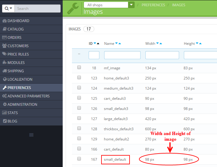
1. In Product Options part, The Size image (W x H) parameter is set “small_default”. To view the size of image, please go to PREFERENCES >> Images as the image below:
PRODUCTS OPTIONS
- Size image(WxH) – Select size of product image in list box.
- Display Slider Product – Allow to display slider product or not.
- Display Navigation – Allow to display navigation button or not.
- Show Type Navigation – Allow to display type of navigation: Hover/Show.
3SUPPORT – Back to top
Thank you so much for purchasing this module. If you have any questions that are beyond the scope of this help file, please send us via: Support Tickets System
Thanks so much!